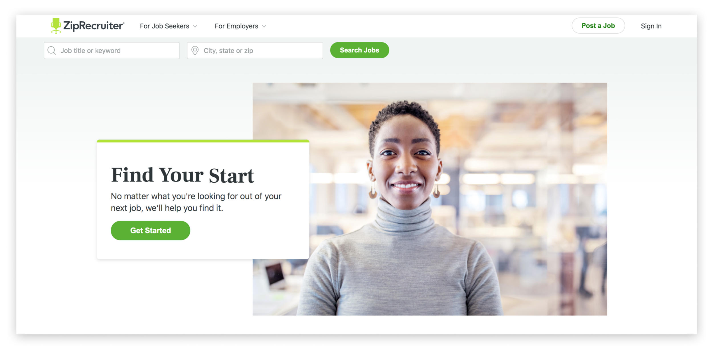
A Refreshed Experience for ZipRecruiter.com
Overview
After developing ZipRecruiter’s hero system and conducting an extensive site audit, we were equipped with the tools to refresh the design and messaging of our priority pages which are the pages that receive the most traffic. We had seven pages on our list to refresh, develop and QA in the span of just four months.
We could have approached the project by saying, “let’s start over and take the opportunity to do a full site redesign?” However, a full redesign put everything on the table to be questioned and this was out of scope for us. First, we needed to prove to leadership the value of making a significant investment in our site. We knew we could improve our credibility and brand image as a leading online employment marketplace through a “site refresh” so we opted for this lower investment approach and avoided the risk of a premature redesign.
PROJECT
Refresh of UI/UX on highest traffic pages:
Contact Us, Employer Homepage, How it Works, Resume Database, Job Sites, Job Seeker Reviews, Plans
MY ROLE
Discovery, research, UX design, UI design, front-end QA
TEAM
Lead Designer (myself)
Creative Director
Motion Designer
Copywriter
Front-end Engineers
Project Manager
Our Approach to Process
In order to accomplish our goal of refreshing seven pages in a short time period, we knew we had to make our workflow more efficient by updating the processes. This includes proper briefing and creating templates and an asset library so future page build outs don’t start from square one.
Our new process looked a little like this:
Brief in
Creative brief: Understand the content of the page, establish testing metrics when needed, clarify and challenge initial assumptions, gather pain-points and insights
Stakeholder questioning: Understand the stakeholder’s vision for the success of the page and their perspective on what the visitors’ needs are for that page (e.g. contact us)
Competitor audit: With each page, we analyzed competitors based on their strengths/weaknesses, which helped us identify what the market offers
Solve
Interpret the brief with empathy for the visitor and synthesize findings
Brainstorm with team members to determine flow of content and refine messaging if necessary
Wireframe structure of the page and introduce any new functionality
Vet wireframe solutions with our front end engineering teammates
Visualize
Apply UI and design visual solutions to explain the narrative.
Interact (only on pages that required motion)
Storyboard graphics
Collaborate with motion designer to bring interactions to life
Problem
At a high level, there were a bevy of fixes to unify this site. Specifically, the visuals were inconsistent, there was no cohesion in color choices, the user experience was suffering, and there were lots of outdated or unhelpful content.
When we looked at the big picture, we knew that these problems were our roadmap for what needed to be fixed. Here is a before shot of how the site looked collectively across the seven pages that needed to be refreshed.
How We Solved the Visual Problems
IMPROVED LAYOUT AND CONTENT
To break down the complexities of the ZipRecruiter product for site visitors, we took the zig zag layout approach where copy and visuals alternate side to side down the page. It’s one of the more popular layout patterns known for its ability to make content scannable as the eyes move along the page following a Z-letter direction. And because we believe in showing and telling not just telling to convey the power of our technology, this layout helped us to accommodate animations that highlight our product features.
In addition to making our layouts consistent, we enhanced our content by sprinkling in social proof and claims to align to in-market creative.
BROUGHT THE PRODUCT TO LIFE
Illustration should be informative and provide context and guide the visitor through the product story. Our existing illustration styles weren't accomplishing this consistently. They suffered from inconsistency — our style wasn’t defined — which didn’t present our brand in the best light.
While many tech companies opt to represent their brand through illustrations of people, we used other visual aids to break down the intricacies of our product features. We discovered that the product was best conveyed through a combination of consistent animation, iconography, and photography. All of this in union strikes a balance of humanizing our brand and simplifying the subject matter.
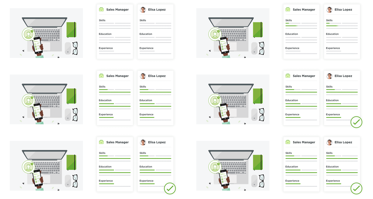
Before: The previous static illustration didn’t clearly break down the complexities of our powerful matching technology.
After: In the new animation and simple visuals, the matching technology is now clearly articulated to the visitor.
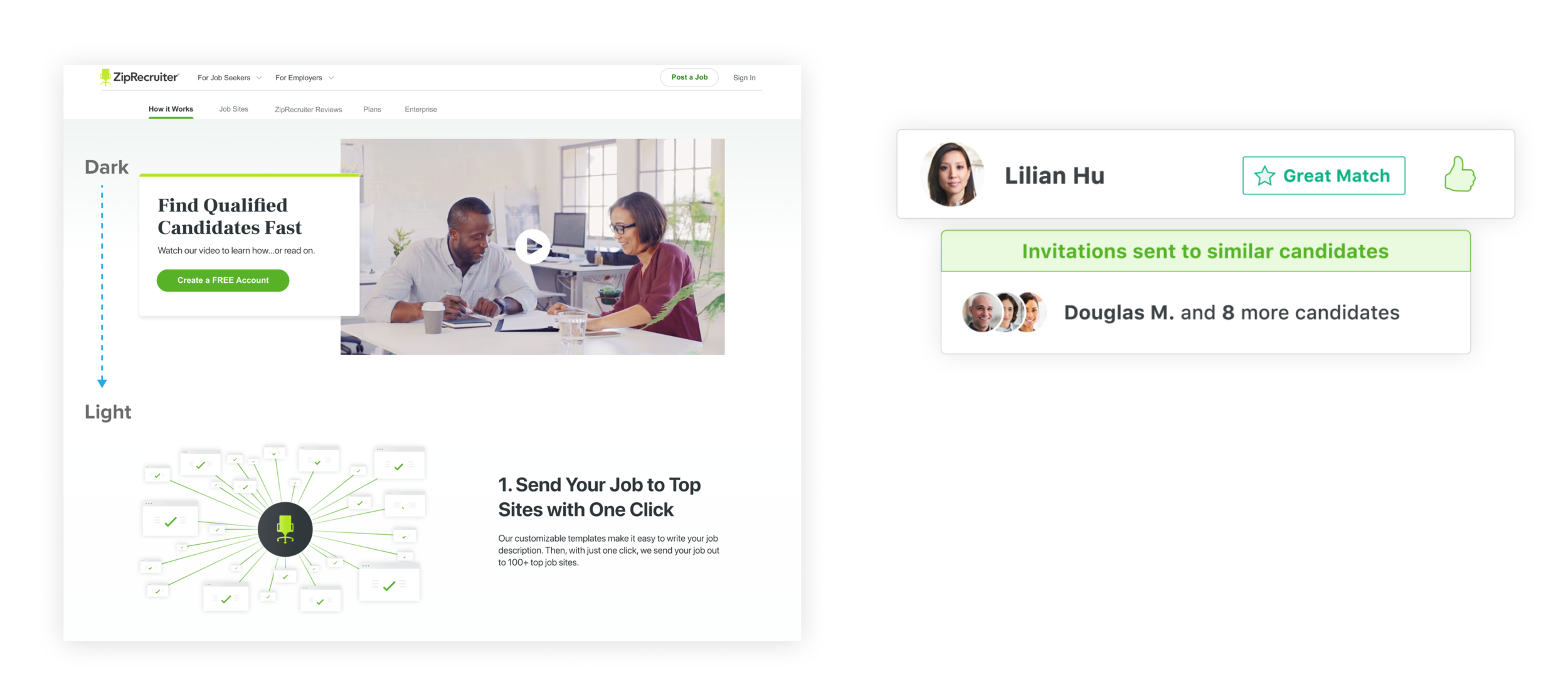
Left: Gradient progression from dark to light indicates the start of a new section.
Right: Here, the thumbs-up in medium and lime greens call attention to the action-oriented icons
(e.g. indicate candidate rating).
ADDING UNIFORMITY THROUGH COLOR AND TYPOGRAPHY
Consistent typography and color plays such a pivotal role in our perceived value and credibility. The previous use of teal, grey, and mismatched typefaces could have been confusing to visitors as they navigated through the site. As with our new hero system, we carried out the serif typeface and applied consistent color proportions to the rest of the pages.
Pairing Frank Ruhl Libre (serif) with the native sans serif font implemented hierarchy across content while allowing the beautiful shapes of the serifs shine. The gradient in the hero progressed through the rest of the page to indicate the start of a new section. Each illustration used the medium and lime greens to call attention to the action-oriented icons (e.g. thumbs-up to indicate candidate rating).
HUMANIZE THE PRODUCT THROUGH PHOTOGRAPHY
The hero wasn’t the only place where photography helped to humanize the ZipRecruiter brand. On our employer homepage, we leveraged our existing television assets that showcased real employer customers interacting with the product. In other places, we utilized stock photography, but strived to capture the authentic moments in the workplace to show confidence in finding that perfect job or candidate. Our goal of balancing photography with UI visuals properly conveyed the human connections with the product.
How We Fixed the UX Issues
Throughout our refresh, we didn’t just set out to visually update. We began by understanding the purpose of each page and simultaneously we came across opportunities for solving other issues.
During our research phase, we synthesized existing pain points and insights, and solved a number of UX issues across the highest traffic pages, including:
Contact Us
Resume Database
Job Seeker Reviews
Contact Us
THE PROBLEM
We were already tasked with updating the UI and enhancing UX for the contact us page but the customer service team brought some pain points to our attention.
Since our customer service team is tasked with retaining and helping employers, every job seeker case they receive (email or phone) takes away from serving employers. The lower the number of inbound job seeker cases, the better.
As a result, we identified a couple of big opportunities for the customer service team:
Increase the adoption of Solvvy, which is a self serve 3rd party chat that launches from any page and pulls answers from our support articles.
With the implementation of Solvvy, it will reduce inbound job seeker cases.
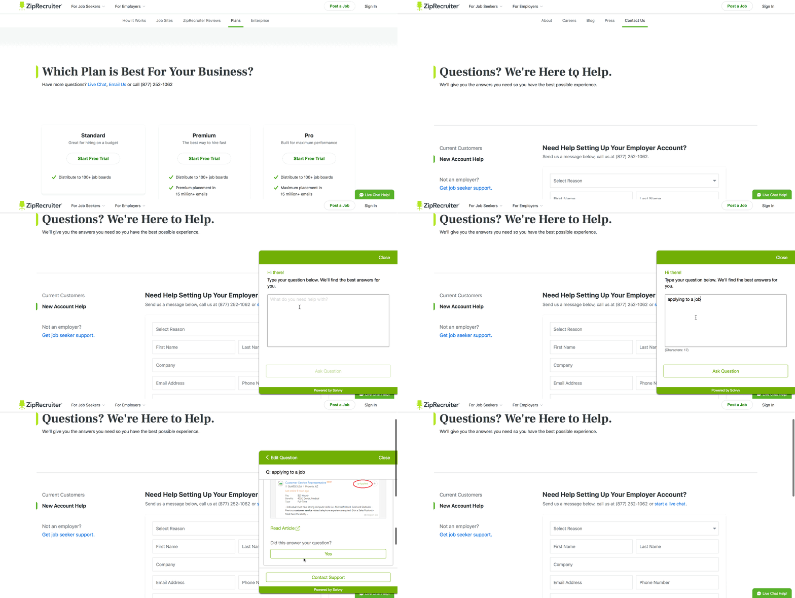
Below is a snapshot of how the navigation and Contact Us page looked.
OUR SOLUTION
In order to integrate Solvvy and resolve the organization of help links in the navigation, we recommended the following UX changes:
We moved the ‘Help’ links in nav to the job seeker and employer dropdowns
Rerouted all job seeker support links to Solvvy
Eliminated the job seeker contact page
Removed an unneeded phone number in footer
Here is a demonstration of Solvvy being used for a job seeker question, which can be accessed under Job Seekers in the navigation. In the event a job seeker visitor lands on the employer contact page, they can access support from the link listed.
RESULT
Since the new implementation:
The total number of inbound job seeker cases decreased by 37%
Total number of Solvvy User Queries
increased by 16%
This was a perfect example of providing value to stakeholders by looking beyond visual execution and finding opportunities to fix issues and enhance the user experience.
Resume Database
THE PROBLEM
Our existing hero experience had a “faux” search functionality where an employer could search for candidates in the resume database. However, you must be a paying subscriber to search through the resume database. This experience was misleading and looked like we weren’t being honest with employers.
Before we solved the issue, the flow looked like this:
THE SOLUTION
In our solution we needed to be more informational with the content and conclude the page with the funnel in order to capture employer registrations.
We proposed the following:
Eliminate the first step. The second step in the flow should become the landing page for Resume Database persuading visitors to search millions of resumes by signing up to be a subscriber.
The content below the hero should contain visualizations of the powerful features of the resume database to encourage sign up at the funnel at the bottom of the page.
RESULT
Our hopes with the improved experience is to reduce registration drop off from prospective employer subscribers. Ultimately, we want to increase their intent to sign up in order for them to find high quality candidates through the resume database.
Job Seeker Reviews
THE PROBLEM
Our Job Seeker Reviews page struggled from lack of visual consistency, but was also inefficiently utilizing the layout to properly convey the job seeker experience.
Some of the issues we had to combat were:
Job seeker quotes that were either outdated or weren’t relevant and were inefficiently displayed in a long list format
No consistent hero with correct hierarchy to capture the attention of the visitor
Missed opportunities for capturing job seeker registrations
Unnecessary emphasis placed on side rail content (job seeker advice and mobile app)
OUR SOLUTION
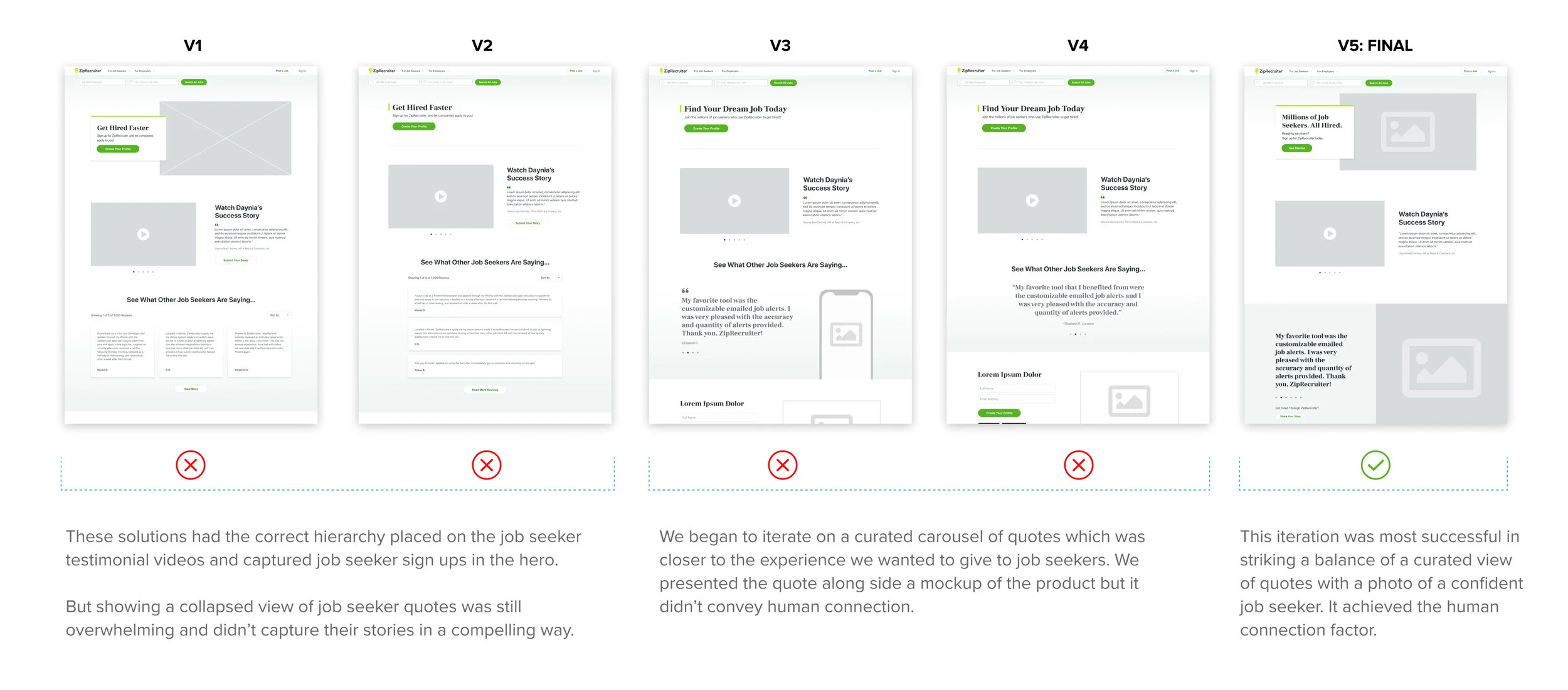
Through iteration, we proposed the following solutions:
To reduce the overwhelming number of job seeker quotes, we recommended a curated carousel experience which captures the success that each job seeker has had with ZipRecruiter.
Utilize new hero template with CTA to reinforce job seeker registration. Added a confident hero image for human connection.
Improved experience with new video carousel that summarizes how ZipRecruiter helped to overcome a specific challenge.
RESULT
Each section in the refreshed design captured the successful experience that job seekers have with the ZipRecruiter product. With our new UX decisions in place, our hope is that this improves our credibility and brand image to job seekers.
Outcome
Thanks to our decisions during the refresh process, we have achieved our goal of eliminating design debt, which resulted in elevating the ZipRecruiter brand by demonstrating the company as an industry leader. Stakeholders were able to see the value in the refresh due to elevating the brand image without hurting conversion rates, which in turn has them optimistic for implementing changes to the remainder of the site.
Additionally, we have achieved our goal in establishing systems to ensure future changes or additions to the site will stay consistent with our revamped design. This not only establishes a clean look for the company, but also helps us be more efficient on the backend.
To put this into perspective, as of December 2018, it typically took us 2-3 months to design, develop, and launch new marketing pages. Today our standard project scope is 5-6 weeks from brief to launch!
Our achievements now allow us to scale the site, and while we don’t know exactly what that entails yet, we now have a much cleaner pathway to forge ahead without further design debt!
SEE MORE WORK


