Food & Water Watch
Overview
With more than 2 million supporters, Food & Water Watch fights for safe food, clean water, and a livable climate for all of us. The main areas of work are advocacy, research, and organizing in support of banning factory farms, banning fracking, and fighting water privatization.
In an effort to shape public opinion and legislative action, Food & Water Watch’s research team produces dozens of long-form print reports which showcases hard-hitting evidence to stop the polluting industries. The digital content and strategy team had a very tall task with reimagining how the print reports could be presented on the website in an engaging and interactive manner.
My role was to spearhead the creation of the digital research product through a responsive design system that could efficiently be adapted across varying levels of reports.
PROJECT
Long-form Digital Research Articles
MY ROLE
Discovery, UX ideation, UI, front-end QA
TEAM
Design Lead (myself)
Freelance Designer
Web Content Manager
Digital Strategy Director
Researcher
Front-end Developer
Problem
The print reports weren’t primed for a digital experience so they needed to be designed to identify proper navigation, key learning moments for readers, and content interactivity. During the discovery phase, we found the following which helped inform our design decisions:
The reports were embedded in an Scribd iFrame on the research page making it a difficult experience to read long-form content on any device.
The reports are nuanced and filled with heavy use of research jargon that the majority of our audience won’t understand.
The personal stories or sidebars were an opportunity to engage readers in a relatable way which couldn’t be achieved in print format.
Food & Watch Watch’s team infrastructure is small. The website team consists of a designer, content producer and a web developer. How could we efficiently produce a report each month adapting the building blocks of the design system without overwhelming the team?
There are lots of data visualizations throughout the reports that are worth displaying animation and interactions.
BEFORE
Research Features
The Solution
During the discovery phase, we had determined the following features for the product:
Establish navigation systems throughout the report to walk the reader through lengthy sections and break down advocacy steps.
Activists and prospective donors can easily sign a petition related to the issue featured in the report.
Show footnotes and endnotes in an unobtrusive way.
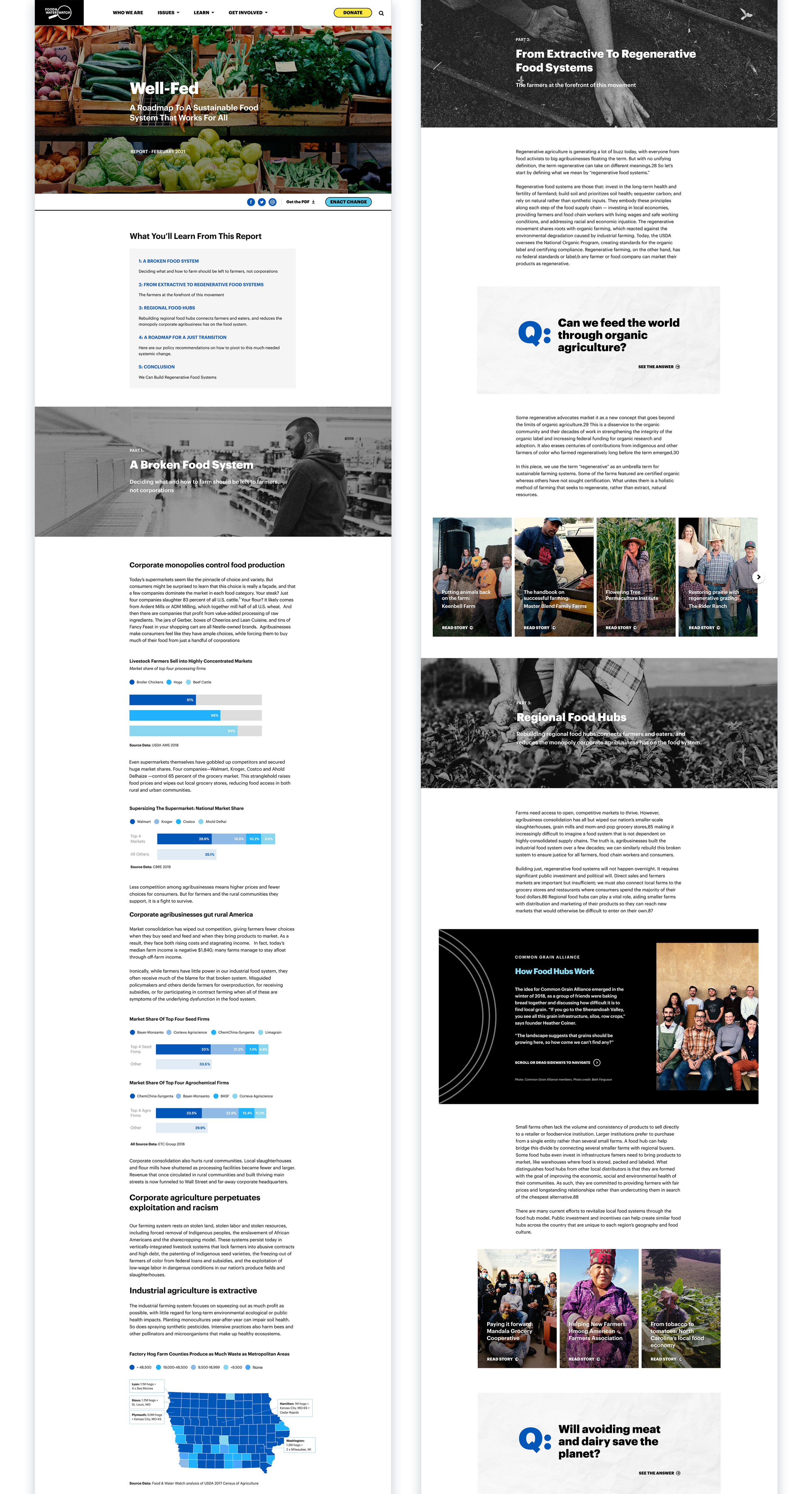
Interactive blocks to feature interviews, stories, sidebar content and Q&A unique to the research but don’t navigate the reader away from the report.
Build or use a third-party plugin to easily create beautiful and interactive data visualizations.
FINISHED PRODUCT
Evolving the Brand
Ensuring the research captivated the users from the start was our primary goal but I also had the challenge of evolving the Food & Water Watch brand aesthetic across the system. I wanted the look and feel to be different from that of an article or issue page on the site. I was inspired by long-form articles from Reuters, NY Times, Vox and Grist. They all utilized impactful photography which evoked the tone of the story. However, having access to a photographer or library presented a challenge being that we didn’t have the budget or infrastructure. I had to rely on stock photography, creative commons or internal images taken by organizers. To make these images feel more elevated and editorial, I applied a high contrast black and white filter.
As with the rest of the site, we carried over the Food & Water Watch palette of black, white and shades of blue. Sticking with a simplified palette allowed the content to compliment the imagery and other UI elements.
The Results
Unfortunately, we don’t have data of user engagement with the embedded reports prior to launching the new site so we are unable draw direct comparisons with the new research product.
To give an idea of the impact, when we published our first report (Well-Fed), it had 3,649 page views in one year. When we published a PDF version of another report on the site, there were only 653 page views.
The reports are continuously the most top performing content monthly for Food & Water Watch.
SEE MORE WORK


